User reserach & Audits
Conducted both competitive and comparative audit to bring insights to Google that influence the future moving forward. Translated our implications to query archetypes. Establish an opinion of what is valuable to move forward with and what to leave behind. Make open web accessible to everyone.
Goal
Deconstruct and identify key findings for product listings, videos, and collections, evaluate the way each format type is broken down, what's working, and what that means for Google Search.
What we looked for
Per canonical format, describe how do they work and how are they governed. Degree of variation or consistency across platforms. Supported content types and supported multimedia aspect ratios. Actions framework that support each format
State of the format

Finding
Product listings are becoming more storyful. How can they still meet user needs?
In the more visual web, the line between product listings and story-driven content becomes blurred. This has the potential to help brands break through commoditization of products and sellers, and help create differentiation between brands.
In some cases, more narrative product listings can come at the cost of user comprehension. More visual storytelling formats help streamline the overall look and feel of the page, but the difficulty of comparison shopping increases dramatically for the user.
Implication
When storytelling in product listings is leveraged appropriately, sellers and users alike benefit from the richer experience.
How might we...
- Construct a format that preserves key details for user comprehension?
- Enable products to feel visually striking and empower brands to avoid commoditization?
- Consider how this format flexes dynamically based on the user's intent such as low vs. high consideration purchases?
Video

Finding
Users consume a variety of content types simultaneously. Multisensory experiences encourage entertainment, learning and discovery.
Users are accustomed to digital multitasking within their smart phone. Users can watch videos, while looking at other forms of content, replying to texts, scrolling on social, and playing games.
Engagement and retention with accessible video content continues to outperform other types of media.
Implication
Second screening occurs on one single device within and outside app-platforms thus creating a more flexible and dynamic environment in order to accomplish multiple tasks at once.
How might we...
- Reinvent the Search experience such that users can consume multiple tasks concurrently in appropriate contexts?
- Be a meaningful part of user's preference for multiple stimuli?
- Introduce new capabilities to assist discovery?
Collections
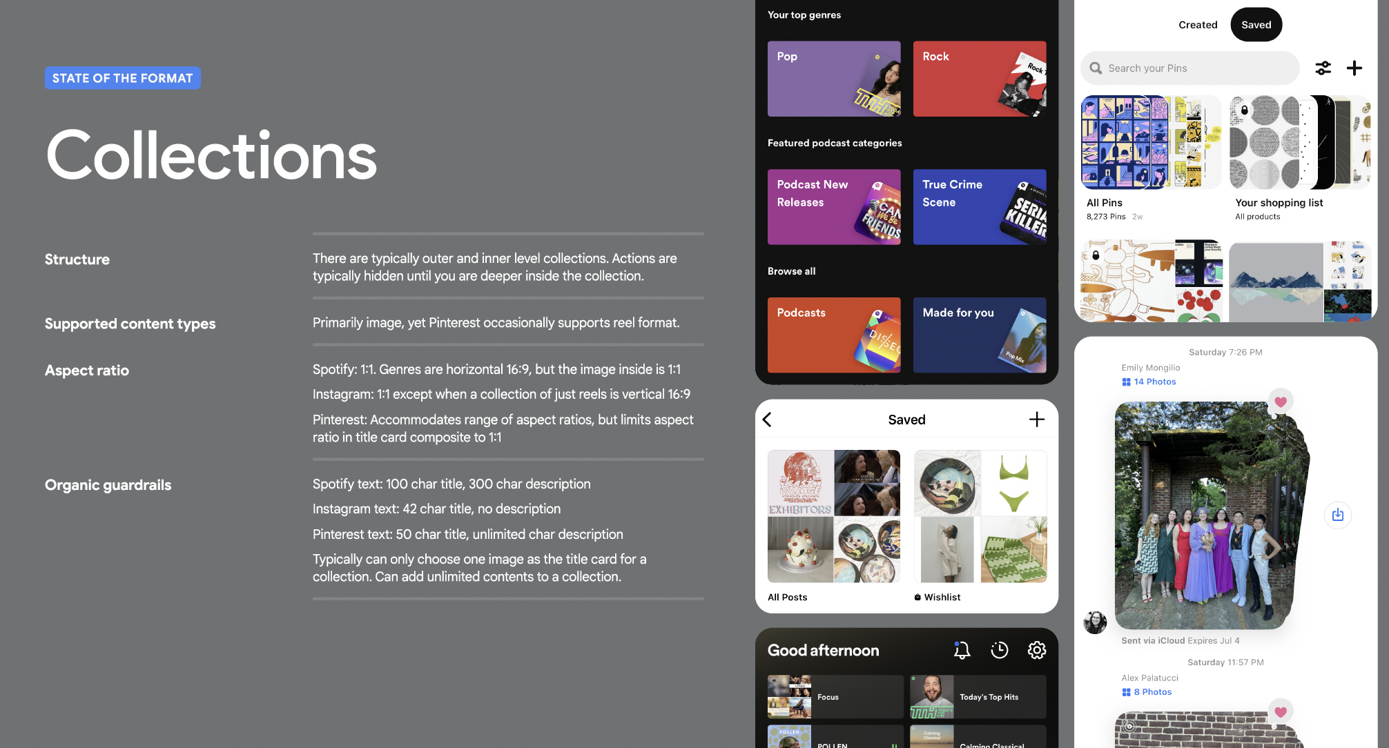
Finding
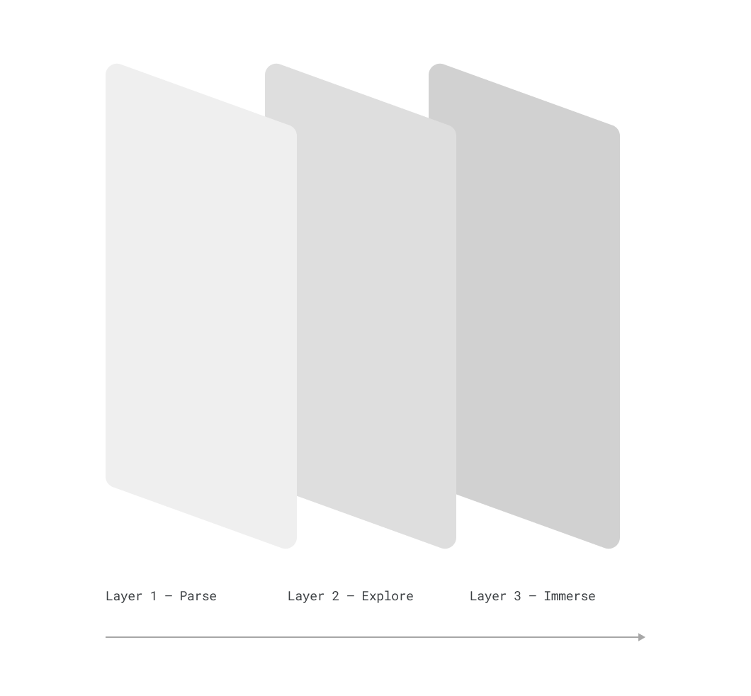
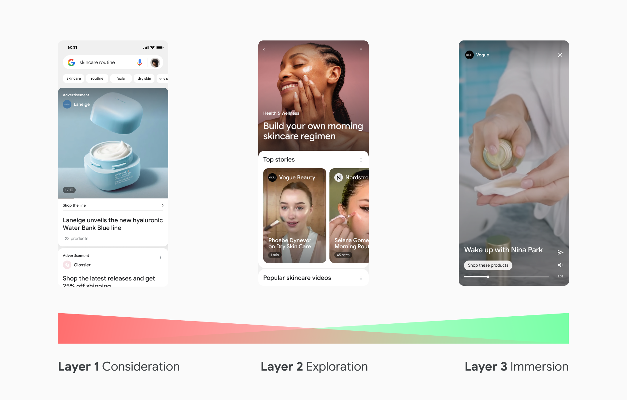
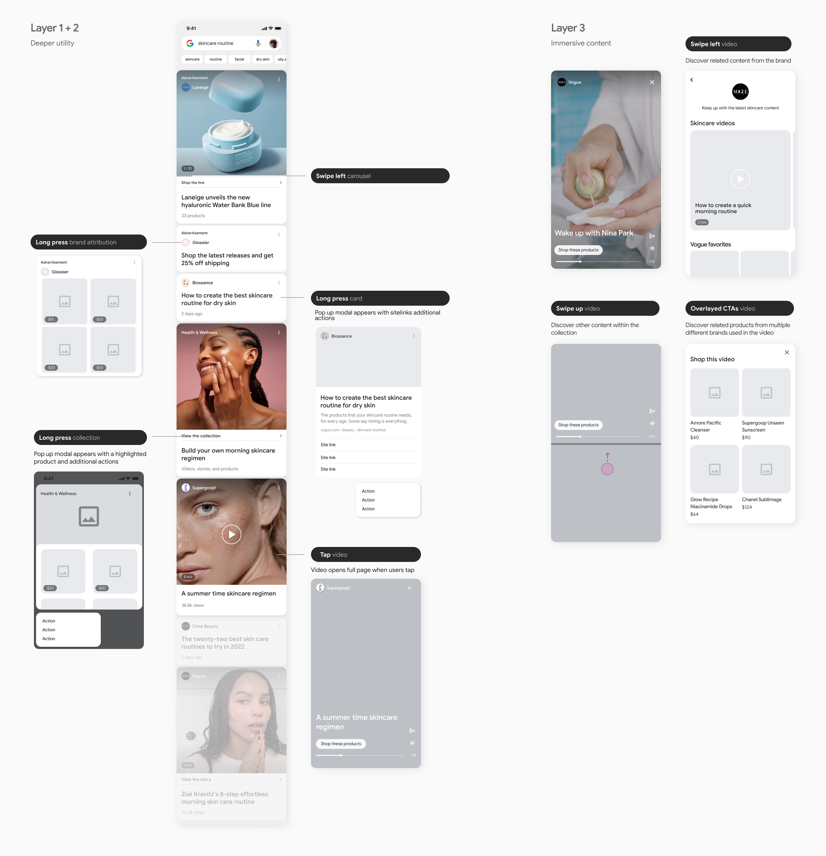
Wayfinding and nesting of collections could unlock a more helpful and simple browsing experience.
The way the page is designed informs users how deep they are into the platform. Users can intuitively know when they are inside or outside of a collection, with no need for wayfinding support from elements like breadcrumbs. Most platforms keep to just 3 layers of depth. This gives the user enough control while not being overwhelming
Layers
- First layer - Category
- Second layer - Pieces of content within category
- Third layer - Singular piece of content
Implication
Nesting search results into "collections" can allow for more efficient parsability, allowing users to seamlessly move up and down the funnel between discovery and selection.
How might we...
- Utilize nesting for results to find information more productively?
- Introduce collections as a way to visually direct users towards information they desire especially as we move towards a more visual SRP?
low-fidelity format exploration
Current state of Google search
Current state production of the search results page is ready for a modernization that better caters to Google's users.
There's an overuse of blue links which mitigated the importance of CTAs. Colored links alone are not sufficient in meeting user's accessibility needs and is an outmoded approach.
Based on our findings and implications from the previous 2 sprints, we stress-tested the imperatives with gestural sketches. This helps us better understand the possibilities and boundaries of various formats. Began building towards a tight visual system.

Actions framework explorations with more meaningful text and visual-first efficiency.

Actions framework
We recommend utilizing a rounded card container for SRP formats as it provides larger tap areas, doesn’t rely on text treatments for clickability cues, and is overall a better indicator of tappability.
Information architecture
IA focuses on organizing, structuring, and labeling content on the SRP cards in an effective and sustainable way. The goal is to help users find information and complete tasks.

Defining a Points system
Assigning a value to complexity by giving each element of a result a point value, we can balance each result's complexity and weight on the page.

Key findings